
didn’t really to make these photos emulate Rauschenberg’s white canvas period (encountered a room devoted to them in the new modern wing of the Art Institute of Chicago), but since it happened…
Category: Arts
Art news from all over (not including film arts and music arts)
Homage to Robert Rauschenberg

Modern Wing, Art Institute of Chicago
From the Rauschenberg wikipedia page:
“In 1951 Rauschenberg created his “White Paintings,” in the tradition of monochromatic painting, whose purpose was to reduce painting to its most essential nature, and to subsequently lead to the possibility of pure experience.[22] The “White Paintings” were shown at Eleanor Ward’s Stable Gallery in New York during October of 1953. They appear at first to be essentially blank, white canvas. However, one commentator said that “…rather than thinking of them as destructive reductions, it might be more productive to see them, as John Cage did, as hypersensitive screens – what Cage suggestively described as ‘airports of the lights, shadows and particles.’ In front of them, the smallest adjustments in lighting and atmosphere might be registered on their surface. Rauschenberg himself said that they were affected by ambient conditions, “so you could almost tell how many people are in the room.”
Reading Around on June 15th
Some additional reading June 15th from 08:19 to 13:13:
- Et Tu Google – Pay the artist, simple as that. “So, one of the things I hear constantly from my wife is her…annoyance at people who think they can get weeks of work out of her, but in lieu of cash, they’ll give her “exposure”.”Exposure” is a barely nicer way of saying “I’m not paying shit for your work, but maybe someone who isn’t a cheap douchebag will see your art and throw you a bone. Besides, aren’t artists against money?“
- Oklahoma Highway Patrol finally releases video of trooper attack on paramedic – Before the encounter is over, [Officer ] Martin has assaulted the paramedic, frightened the patient, and created a neighborhood scene that is so unprofessional that it’s just about unbelievable. Enraged, he calls for backup, repeatedly threatens the unit’s operators, curses, chokes and slams White up against the ambulance several times–an action the patient later said rocked the unit, frightening her. He also keeps screaming “you insulted me.” The trooper later says that Franks made an obscene hand gesture as Martin passed the ambulance, a charge Franks denies. Martin plans a press conference on Monday, according to Fox 23. Martin, who had his wife in the patrol car with him for an as-yet unknown reason, later declared that he’d recently come back from service in Iraq
-

- Troubleshoot your Internet connection – some good tips
- Q and A: eMusic CEO Explains Controversial Price Increase, Sony Deal | Epicenter | Wired.com – “artists with albums soon to be sold on eMusic as part of the deal include Captain Beefheart, Black Rebel Motorcycle Club, Kate Bush, Miles Davis, The Clash, Miles Davis, Franz Ferdinand, Robert Johnson, Kings of Leon, Modest Mouse, Psychedelic Furs, Lou Reed, Patti Smith, Spiritualized and the Stone Roses”

The Wire Season 2

“The Wire – The Complete Second Season” (Ernest Dickerson)
As if you need any more prodding from me to watch The Wire in its convoluted, messy, beautiful entirety…
what David Simon, Ed Burns and company are doing here is revealing that “The Wire” is going to be far more than a cops vs. drug dealers saga. It’s not a crime show. There’s a lot of crime in it, yes, but it’s a story about the death of an American city (really, the death of the American city), and little by little the show is going to take us into every corner of that city. Last year, it was the projects and the drug war raging within them. This season, our focus turns to the ports, and to the state of blue-collar, industrial America, which has been phased out in favor of a service economy that many of these guys just aren’t equipped for. As Simon referred to it in a few interviews, it’s “a meditation on the death of work and the betrayal of the American working class.
As has been said many times before, the opening scene of each “Wire” premiere is like a mission statement for that season. We open with McNulty riding forlornly on the boat, staring out at the many abandoned factories ringing Baltimore’s harbor. Once upon a time, these places were thriving concerns that provided jobs for any man willing to put in the work, no matter his background or skill level; now they’re rotting husks, relics of a time that barely exists anymore. Jimmy looks at those factories and thinks wistfully about the way things used to be, the lifestyle his father and his father’s friends had. Then he and his partner Claude answer a distress call from a party boat filled with yuppies who couldn’t care less about Bethlehem Steel or Domino Sugar; they just look at the harbor as a place to get their drink on while dancing to “Blue Skies.” Jimmy notes that they have to tow the boat out of the shipping channel, but at the same time, the harbor seems so dead that it hardly seems worth the bother; it’s been a long time since cargo ships were constantly coming and going from this port.
Recognizing all of this, Jimmy takes a bribe to tow the boat to an out of the way location where the party can keep going, and there you have your season in a nutshell: the port workers are dinosaurs, being replaced by wealthy people looking to party (or buy condos with waterfront views), and the only real money to be made around here is through bribery.
[Click to continue reading The Wire, Season 2, Episode 1: “Ebb Tide” (Veterans edition) – NJ.com ]
I recently re-watched the entire series, but was too lazy to tap out my thoughts on it. Suffice it to say, I will probably watch the entire series again for a third time next year. Such a nuanced television novel rewards multiple viewings.
Artists Should Get Paid
I know I’ve linked to this Harlan Ellison rant before, but repetition is strength. Right?
And, finally, to artists of all genres – Harlan Ellison is a loud, irascible and vehement voice for respect and payment. He is the rare combination of a well-developed artistic mind combined with exquisite business smarts and an innate sense of unwavering justice. Ellison dares, in one of his rants, to speak out against a major film studio who wanted to re-release material involving him on DVD. When asked to be paid for his participation, the young assistant seemed shocked. A highly unfortunate reaction on her part – as she then became the target for a giant Harlan Ellison emotional whipping. Did she expect her gas station attendant to give her free gasoline? Her doctor to perform surgery for free…and did SHE, in fact work for free?
Artists are sick to death of trying to pay their bills off of jobs that “offer great exposure.” Harlan Ellison laments the fact that professional writers are constantly being undercut by amateurs these days… and he’s right. It might behoove all of us to listen to Harlan’s rants in DREAMS WITH SHARP TEETH and re-inspire ourselves as a nation to “get what we pay for” and maybe bump up our standards a little.
Anyway Mr. Ellison’s amusing rant re: the Warners Brothers release of a DVD of Babylon 5
httpv://www.youtube.com/watch?v=mj5IV23g-fE
Pay the artists!
Bonus:
Why is Harlan Ellison’s name on the end credits of THE TERMINATOR? Find out the truth in this video.
httpv://www.youtube.com/watch?v=DwyyJ3D3g1E
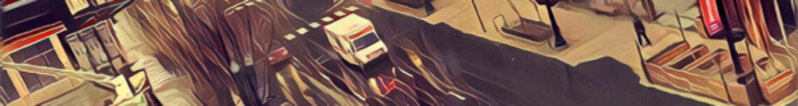
Snap Art and the New Yorker
I am very happy with my purchase of Alien Skin software, curious what happened to this question from last year?
We are pretty sure that the cover of the September 15 issue of The New Yorker was made using Snap Art. I couldn’t get anyone from the magazine to return our e-mail, so we’re not 100% sure. However, Tom Welsh, the author of Snap Art, says he would recognize his baby anywhere. You can check out the cover on The New Yorker web store. Eric Drooker made the art. There was probably some careful work done by hand too, but we think that most of the painterly brush strokes are from Snap Art. [From Messages from Alien Skin Software]
Hmm, here’s the cover, you decide:

John Cale and The Velvet Underground

“The Velvet Underground & Nico” (The Velvet Underground, Nico)
Like a lot of musical obsessives, The Velvet Underground was essential listening when I first began exploring music.
Jonathan Jones had the good fortune to check out John Cale’s exhibit in the Venice Biennale. Sounds like an interesting exhibit, but of course, The Velvet Underground’s history is always on the agenda:
It sounds at first like an electronic whine, a build-up of noise in the amplifier. Then there’s Lou Reed’s voice, young but hardened: “When the smack begins to flow, and it shoots up the dropper’s neck, and I’m rushing on my run, then I feel just like Jesus’s son.” Behind it all, there’s that strange keening, humming note. Listen to the Velvet Underground’s Heroin on headphones and you realise it’s not feedback after all, not a synthesised warble, but the rich timbre of a violin playing a single note, held for a disturbingly long time. It’s the darkest thing in the darkest of songs. If Reed sounds as if he’s made a pact with the devil, then the musician who plays that buzzing fiddle – John Cale – must be the devil himself.
and doesn’t sound like any feel-good reunion between Lou Reed and John Cale will ever occur
Andy Warhol produced the Velvets’ first album and designed its banana peel cover. No figure in modern culture is more misunderstood than the Velvets’ manager, and nobody speaks up for Warhol more eloquently than Cale. He won’t hear a word against Andy. The Factory, he insists, was a true underground – “it was outrageously creative and vital” – and Warhol cared about, and properly curated, the Velvets. A rare bit of footage Warhol shot in the Factory shows Cale fiddling with the amplifier, while Reed strums and drummer Maureen Tucker knocks out her steady, dry beat. Warhol listened carefully, and remembered it all. “He was the one who’d remind us of an idea we’d forgotten.”
Cale is still smarting from what he sees – amazingly – as the tragic waste of the band. Warhol took them to the west coast, he tells me. While they were away, Bob Dylan’s manager took out a lease on their Manhattan venue. This was part of Dylan’s feud with Warhol, whose world is caricatured in lyrics on the 1966 album Highway 61 Revisited. Then Reed sacked Warhol and Cale. A new manager, says Cale, “appealed to Lou’s desire for glory”. In the years since, Reed and Cale have occasionally got back together – but from the furious way he talks, I’d say any further reunion was unlikely.
All through the solo career that followed, Cale has returned again and again to his Welshness. He has recorded Dylan Thomas poems, and in the early 1970s composed a nostalgic Thomas-inspired song, A Child’s Christmas in Wales. And apart from the Thomas obsession, there is a lyricism to his music, one that struggles with his severity and evokes all those years in the Welsh Youth Orchestra.

If you own just one Cale solo album, Paris 1919 is my favorite.
One of John Cale’s very finest solo efforts, Paris 1919 is also among his most accessible records, one which grows in depth and resonance with each successive listen. A consciously literary work – the songs even bear titles like “child’s christmas in wales,” “macbeth,” and “graham greene” – paris 1919 is close in spirit to a collection of short stories; the songs are richly poetic, enigmatic period pieces strongly evocative of their time and place. Chris Thomas’ production is appropriately lush and sweeping, with many tracks set to orchestral accompaniment; indeed, there’s little here to suggest either cale’s noisy, abrasive past or the chaos about to resurface in his subsequent work – for better or worse, his music never achieved a similar beauty again.
Reading Around on May 8th through May 11th
A few interesting links collected May 8th through May 11th:
- TidBITS Opinion: SFMOMA’s ArtScope Offers New Way To Browse Museum Collections – “The San Francisco Museum of Modern Art’s ArtScope is a great example of an innovative approach to bringing a museum’s collection to the Web. ArtScope is a visual browsing tool comprised of a thumbnail grid displaying 3,500 works from the SFMOMA’s permanent collection. The grid is zoomable, displaying a lens which can be moved over it to magnify certain areas, enabling users to view hundreds of artworks simultaneously, or just one at a time in close detail.”
-
Death Star & Star Wars Spacecraft Fly Around San Francisco – If you haven’t already seen this…
“Speaking of great Star Wars videos, Michael Horn made this absolutely amazing video on Current featuring the Death Star and various Star Wars spacecraft flying around San Francisco during Imperial Fleet Week”
-
The Official George W. Bush Presidential Librarium – Completion of the George W. Bush Presidential Library at Southern Methodist University in Dallas, Texas may be stalled indefinitely, due to an apparent lack of funding, public support, and basic legality. Make no mistake, the public’s desire to endlessly relive Bush’s greatest achievements may go unanswered for years to come—and his legacy remain (like America) in limbo.
All hope is not lost. We at Origen & Golan Architects are proud to unveil the plans for the George W. Bush Presidential Librarium! Themed attractions provide more entertainment than a library, and more accurately represent Bush’s remarkable legacy—start by exploring The Stax, Supreme Food Court, Book BBQ, and the ever-popular Golden Parachutes. We ask for your support in promoting the Librarium among your colleagues. We cannot blink.
Justice Stevens Is an Oxfordian
I wonder, did Shakespeare wear blue jeans? Would George Will talk like a peasant in honor of Shakespeare?1

In his 34 years on the Supreme Court, Justice John Paul Stevens has evolved from idiosyncratic dissenter to influential elder, able to assemble majorities on issues such as war powers and property rights. Now, the court’s senior justice could be gaining ground on a case that dates back 400 years: the authorship of Shakespeare’s plays.
Justice Stevens, who dropped out of graduate study in English to join the Navy in 1941, is an Oxfordian — that is, he believes the works ascribed to William Shakespeare actually were written by the 17th earl of Oxford, Edward de Vere. Several justices across the court’s ideological spectrum say he may be right.
[quote]
…
In a visit to Shakespeare’s birthplace in Stratford-upon-Avon, Justice Stevens observed that the purported playwright left no books, nor letters or other records of a literary presence.
“Where are the books? You can’t be a scholar of that depth and not have any books in your home,” Justice Stevens says. “He never had any correspondence with his contemporaries, he never was shown to be present at any major event — the coronation of James or any of that stuff. I think the evidence that he was not the author is beyond a reasonable doubt.”
All signs pointed to de Vere. Justice Stevens mentions that Lord Burghley, guardian of the young de Vere, is generally accepted as the model for the courtier Polonius in “Hamlet.” “Burghley was the No. 1 adviser to the queen,” says the justice. “De Vere married [Burghley’s] daughter, which fits in with Hamlet marrying Polonius’s daughter, Ophelia.”
Shakespeare dedicated two narrative poems to the earl of Southampton, Henry Wriothesley, “who also was a ward of Lord Burghley and grew up in the same household,” Justice Stevens says. “The coincidence…is really quite remarkable.” He asks, “Why in the world would William Shakespeare, the guy from Stratford, be dedicating these works to this nobleman?
[From Justice Stevens Renders an Opinion on Who Wrote Shakespeare’s Plays – WSJ.com]
Footnotes:[non-WSJ subscribers use this link to read the entire article]
- for the record, George Will is one of the biggest pricks working in media today, and recently wrote a jeremiad against the practice of wearing denim. According to Mr. Will, only working class folk should wear jeans, middle class folk and higher society should dress as if they were in an Edith Wharton production [↩]
Reading Around on April 12th through April 14th
A few interesting links collected April 12th through April 14th:
-
Adventures In Foodie Land: darkness, lasers, ninjas, and child labor » NileGuidance: A Travel Blog – “Moto: In Chicago, the epicenter of the molecular gastronomy, Moto is the place to go for an adventure in food technology and what even qualifies as ‘food.’ Listed on the edible(!) menu are post-modern, multi-sensory concoctions by chef Homaro Cantu using mediums such as liquid nitrogen and Class IV lasers. Chili-Cheese Nachos as a dessert, made with chocolate and flash-frozen mango? Sounds like an adventure to me.”
photo of swanksalot
-

-
The Inevitable Clash of Management and Unions | new curator – What’s the best way to diffuse a situation between the management of a museum and a union representing your disgruntled workers?
Hint: Don’t go saying they give “the public sector a bad name”.
- Can the Statusphere Save Journalism? – Recently, I enjoyed a refreshing and invigorating dinner with Walt Mossberg. While we casually discussed our most current endeavors and experiences, the discussion shifted to deep conversation about the future of journalism in the era of socialized media with one simple question, “are newspapers worth saving?”
[photo by swanksalot]
Actors’ Equity Association’s new home
557 W Randolph St, formerly the headquarters of Zonta International, will be the new home of the 48,000 member Actor’s Equity Association.

Actors’ Equity Association, the union of professional actors and stage managers in the United States, has purchased its own building on Randolph Street just a block or two west of the core of Chicago’s theater district. And according to Steven DiPaola, the union’s assistant executive director for finance and administration, Equity is considering moving some of the union’s national back-office functions from New York to Chicago.
According to Chris Jones, the building at 557 W. Randolph was built in 1855, and is one of the few that survived the 1871 Chicago fire. I wonder if there will events held there? Celebrity sightings?
Wine as an Ingredient in Art
Just not quite in the way you might have thought. Sign me up! Sounds fun…

Artists over the centuries have chosen all sorts of seemingly unusual things with which to create their art, from ground-up roots, soils and foods to blood and even urine, as Andy Warhol so infamously proved.
For Matthew Lew, the chosen medium is wine. And his reason for taking the unexpected step is identical to that given by many when asked why they love drinking wine: its terroir.
Terroir is the French word for soil, but it means so much more than that. Terroir is a uniqueness rooted in a sense of a place. That’s important to Lew, who began a few years ago to use wines made around the world to link his work with specific geographical areas.
“It gives a different essence to the piece,” the Chicago artist explained.
A just completed painting, a Tuscan landscape, used two Italian wines, a 2005 Frescobaldi Nipozzano Chianti Riserva, and a sparkling non-vintage Canella Prosecco di Conegliano.
His works are colorful, contemporary, expressive and often bold. Themes range from Buddhas and cityscapes to elegant abstracts. Sometimes, he’ll mix in a client’s favorite wine to give a commissioned piece a special significance.
[Click to read more: From wine glass to canvas, painter explores the visual meaning of terroir — Bill Daley at the chicagotribune.com]
Mr. Lew mixes wine directly into his acrylics, with a bit of randomness as a result. Richer colors sometimes but there isn’t a strict formula.
I just wish I had space to have a permanent painting studio in my apartment: I’d throw a splash of this Ercavio Tempranillo Roble 2006 I’m sipping directly onto my palette just for fun. Frequently, the best art is a result of happy experiments and chance.
Edvard Munch at the AIC
Have been meaning to make it to this show, have the flyer right here on my desk in fact.

[Evard Much – Kiss By the Window, 1892]
It’s true that the artist Edvard Munch (1863-1944) was a hopeless alcoholic who checked himself in and out of various sanatoriums, a Norwegian Lothario who never married and was shot in the left hand by Tulla Larsen, one of his mistresses, when he attempted to end their affair. (Fortunately he painted with his right hand.) But the Art Institute of Chicago’s engrossing exhibition “Becoming Edvard Munch: Influence Anxiety and Myth” (through April 26) rejects the popular notion that his art was a product of his creepiness, a perception that Munch energetically developed himself.
Although Munch is classified with the late 19th-century Symbolist painters whose intense images of inner torment paved the way for 20th-century expressionism, this exhibition demonstrates the broad range of other styles he employed, including naturalism and Impressionism. To be sure, the first major piece in this exhibition, “Self-Portrait With Cigarette” (1895), reinforces the view that Munch was not normal. The artist depicts himself in a Bohemian pose, wreathed in a blue-black haze of cigarette smoke. His face, eyes and hand holding the cigarette are the only luminous points amid swirling shadows. But the show, curated by Jay A. Clarke, surrounds some of Munch’s best work with art of his contemporaries — much of it from the Art Institute’s own rich Impressionist collection and its deep collection of prints and drawings — suggesting that his various themes, motifs and painting styles were only in part contrived to further his reputation as a sick and socially aberrant artist, and were essentially derived from art that he saw and loved.
[From Not All of Edvard Munch’s Art Was a Product of His Creepiness – WSJ.com]
[non-WSJ subscribers use this link]

Evard Munch – Madonna, 1895
Insanely busy though for the next few weeks. The show is up until April, however, and according to something I read, members1 have access to the museum an hour before it opens (i.e., less crowds). Anyone want to go with me?
Footnotes:Members enjoy private viewing of the exhibitions the first hour of every day.
Monday–Friday, 10:30–11:30
Saturday–Sunday, 10:00–11:00
- I recently renewed my subscription [↩]
Another Coming Out Party?
I wonder how Ronald Moore feels about California’s Proposition 8 aka Prop Hate?
From one of our most reliable sources ever:
The new Battlestar Galactica webisodes “The Face of the Enemy” start going on line next month. Two recurring male characters are revealed to be gay.
One hears the first webisode was shown at some sort of Producers Guild event or something. Full-on making out was apparently part of the fun!
Who are the recurring males? Gaeta, whose very name has “gay” in it, never seemed too interested in the girls – but perhaps that’s too obvious?
My money’s on Tigh and Tyrol. Remember how sore Tigh got when he found out the chief was secretly boning Boomer?
Henri Cartier-Bresson

“Henri Cartier-Bresson (Aperture Masters of Photography)” (Aperture)
Was lucky enough to sneak over to the Art Institute of Chicago this week, and explore the Henri Cartier-Bresson exhibit. Wow. My art-speak muscles have atrophied from inactivity1, so I’m not going to bore you with faux critical analysis, suffice it to say, I was blown away, and want to explore the exhibit again before it leaves, January 4th, 2009. I was not familiar with his work, besides perhaps one image that became famous recently2 when uploaded to Flickr. Amazing will suffice as an adjective for Mr. Cartier-Bresson.
The exhibit also mixes in drawings3 from contemporaries, sometimes uncannily similar, sometimes related in other fashion – such as a photo of Henri Matisse in his studio alongside a Matisse sketch.
From the AIC:
To celebrate the centenary of the birth of Henri Cartier-Bresson, the Art Institute will present, for the first time, a comparison of Cartier-Bresson’s photographs to the modern drawings, etchings, and paintings of his contemporaries—works that would otherwise be in storage in preparation for their installation in the Modern Wing.
Henri Cartier-Bresson, the legendary photojournalist whose work was characterized by the term “the decisive moment,” began his career as a painter influenced by the Surrealist poets who were a mainstay of Parisian café culture in the 1920s. Although his subsequent work in photography was concerned primarily with time and timing, it also reveals an appreciation for the irrational and subconscious gleaned from the work of writers and poets of this time.
Pulling from the Art Institute’s Julian Levy Collection—the legendary gallery director who assembled the first exhibition of Cartier-Bresson’s photographs in the United States—this exhibition provides a rare glimpse into the early stages of Cartier-Bresson’s career. Work by his painting instructor André Lhote parallels Cartier-Bresson’s early photographs, as does that of Salvador Dalí. Also included will be work by Giorgio de Chirico, Henri Matisse, Piet Mondrian, and Pablo Picasso that relates to photographs by Brassaï, André Kertész, and other photographers active in Paris between the World Wars.
When I got home, I ordered this book from Amazon
Henri Cartier-Bresson reveals–as only a few great artists have done consistently–the richness, the sensibilities, and the varieties of the human experience in the twentieth century. This volume of Aperture’s Masters of Photography series confirms the genius of the photographer whose pictures with the new, smaller hand-held cameras and faster films defined the idea of “the decisive moment” in photography.
Cartier-Bresson’s imagery is intimate, but it is also utterly respectful of his subjects. In his wide travels throughout the world, he has captured universal meanings through the glimpses into the lives of individuals in scores of countries. Each photograph is in itself a masterpiece of dramatic form; taken together, Cartier-Bresson’s works constitute a personal history of epic scope.
Henri Cartier-Bresson presents forty-two of the artist’s photographs, each recognized a a masterpiece of the medium. In addition, Cartier-Bresson offers a brief statement of his own artistic ethos, his striving for the spontaneity through intuition that imbues his work.
Forty-two 5″X7″ quality reproductions, well worth the $10 price tag. If you have the slightest interest in photography or art history, you should swing by the Art Institute, or at least pick up a copy of this book.
Footnotes:- University of Texas was a long, long time ago [↩]
- A wiseacre uploaded this photo to a Flickr group called “deleteMe”, a group that invites photography critique. Some of the more dismissive comments seem to have been deleted, but plenty still remain, criticizing his lack of focus, weird depth of field, should have been in stronger focus, and so on. Flickr is a great site, but rewards a certain type of photo over all others. Color photos of beaches are fine, but are they really art? Over-saturated postcard style images usually get viewed much, much more than photos containing less technical polish. [↩]
- and paintings? The trouble with spending a couple hours browsing the Art Institute is that there is a certain amount of blur [↩]